Friday, May 6, 2011

Could these be more 1920's Soviet????


These are a few posters by Vladimir and Georgii Stenberg, two brothers from the Soviet Union. I think they totally reflect the time they were made in. The collage style, the clothes in the images, the harsh angles. It all just looks so soviet!

I think it is fascinating to compare this work to some of the modern works by Heads of State. They are in many ways remarkably similar with their bold graphic styles, yet they come from totally different eras!

The Plan

It just occurred to me that I haven't actually clarified how I plan to use all these posters that I've been looking at to influence my own three posters. I've decided to pick three artists to focus on and take elements from each of them to mix into my work.


Pierre Bonnard + Vladimir and Georgii Stenberg + Heads of State

1890 + 1927 +2010

BRIGHT COLOURS + COLLAGE + LOOSE LINES

STAY TUNED

Thursday, May 5, 2011

Tadanori Yokoo...

is just a little bit cool.


I love these collages. They feel so happy!

Wednesday, May 4, 2011

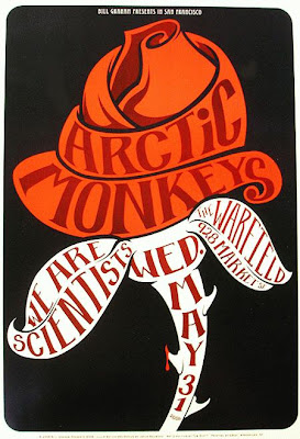
I've been looking at a lot of modern poster design and am finding lots of great graphic artwork, but this style isn't tha appealing to me. I prefer the softer styles of the past. I love the lithographic work of Pierre Bonnard. His works are a lot busier than many modern posters but still retain a cohesiveness.

This is probably his most notable lithograph. His use of line is so effective! Even though his figure is quite flat and there isn't a lot of depth in the background, the looseness and expressiveness of the line makes it work. The font of the title has the same looseness as the illustration, so they both compliment each other!

Saturday, April 30, 2011

A few more heads of state...


These posters keep it simple. They choose one key thing to draw the eye and let that be the focus of the poster. And somehow the text always relates (in colour, shape etc) to the images even though it may not be directly inbuilt.

Thursday, April 21, 2011

the heads of state


Heads of State are a graphic design and illustration company that do a whole range of different projects.
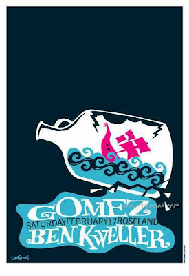
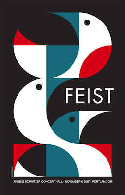
Their posters are really striking. They use really bold clear colours with simple designs that catch the eye. They manage to tie together their text and images through the use of colour and stlyle to create such cohesive images!
Researching can be such a struggle. Where to you start? What exactly are you looking for?

The upcoming posts are some of paths and web links I have followed and found interesting.

Posters seem to be rather varied in there design, mainly dependent on their purpose. Music posters are fascinating to look at, as they are frequently focused on the text, as the music itself can not be clearly represented in an image. When images are used they are often tied quite closely to the text.
Because they are not attempting to represent a certain visual style many are very bold and bright.