Saturday, April 30, 2011

A few more heads of state...


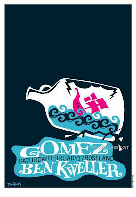
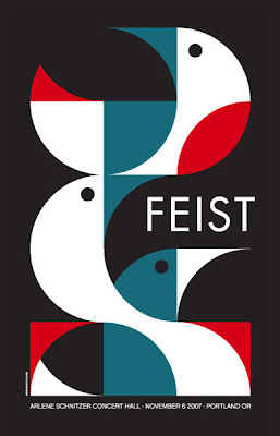
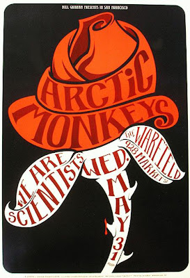
These posters keep it simple. They choose one key thing to draw the eye and let that be the focus of the poster. And somehow the text always relates (in colour, shape etc) to the images even though it may not be directly inbuilt.

Thursday, April 21, 2011

the heads of state


Heads of State are a graphic design and illustration company that do a whole range of different projects.
Their posters are really striking. They use really bold clear colours with simple designs that catch the eye. They manage to tie together their text and images through the use of colour and stlyle to create such cohesive images!
Researching can be such a struggle. Where to you start? What exactly are you looking for?

The upcoming posts are some of paths and web links I have followed and found interesting.

Posters seem to be rather varied in there design, mainly dependent on their purpose. Music posters are fascinating to look at, as they are frequently focused on the text, as the music itself can not be clearly represented in an image. When images are used they are often tied quite closely to the text.
Because they are not attempting to represent a certain visual style many are very bold and bright.


Thursday, April 7, 2011


I know it's not illustration but I really like these graphic posters.

http://davidrager.org/info.php

Wednesday, April 6, 2011

If life were a movie...


These are a few retro movie posters.

I was drawn to these ones because they all retain a simplicity while really clearly displaying their information. I particularly like the way the text is incorperated into the images and they work together to communicate their ideas. I think this is a really important aspect of an effective poster.


Boris Pelcer has some pretty cool posters. This one is for sustainablity in housing at Idaho university. The colours, shapes and text all tie together and are really cohesive!

Boris Pelcer


I love the use of text as more of a logo. It all ties together really well and seems very united. Boris uses these within his posters as a stamp or logo on the side which is interesting.

I don't really like the poster as a whole, but the test is cool.


Asessment 3

They are meant to be a SET OF THREE.

They need to tie together by colour/font/brushes etc.

TEXT TYPE

http://www.smashingmagazine.com/2008/02/25/breathtaking-typographic-posters/

http://ilovetypography.com/

http://www.typography-daily.com/

http://www.typographicposters.com/#